Projects

đź§  Applying Behavioural Design

Case study of increasing the decision of using seQura

  • Tasks:

    Research, design, launch and measure results.

  • Company:

    seQura Worldwide S.A

  • Product:

    Educational Pop-ups

  • Year:

    2023.

widget

Short introduction

About the company

SeQura is a fintech company that offers different buy now, pay later (BNPL) payment methods for businesses to provide to their buyers. Is like Klarna but our most used products have fees and klarna is free for the shopper.

About my role

I was the Sr. Product Designer of the Shopper Growth and Conversion team, and my goal was to find opportunities to improve the growth and conversion of the company while considering the shoppers' economic well-being and aligning them with the company's objectives.

About the educational Popup

The educational popup is the modal that opens when clicking the +info link located in the widget's asset. Both the widget and the educational popup are visual elements that users encounter on the product page of merchants to learn about the installment payments offered by seQura. If you want to know more about the widget you can visit the widget case study

Complete journey of a shopper and the location of the educational popup

widget

Objective

Team objective of 2023

Our 2023 goal as a team was to improve the conversion funnel of our checkout process. This means not only that more shoppers arrive at that checkout but that the majority of those who arrive complete this process.

Heuristic approach

If we want to see results quickly, the best way to do this is to experiment based on hypotheses. Why don't shoppers finish completing the process? What step of the funnel do they fall into? Why of all those who see the popup 100% only 40% make it to the checkout process?

Hypotheses

Shoppers who access the “More Information” popup do so because they still have questions or concerns about seQura. By resolving these uncertainties, the popup can increase trust and confidence, leading to a higher likelihood of choosing seQura at checkout and finalizing the order process.

Framework used: 10 conditions for a behavioural change

Applying behavioural design was key to move beyond assumptions and truly understand how shoppers make decisions in real contexts. Rather than jumping directly into solutions, this approach allowed me to analyze user behaviour across different moments of friction, identifying both psychological and functional barriers that appear when selecting a payment method.

In this case, the focus was on understanding what happens at the moment of payment decision: when users compare options, evaluate risk, and decide whether or not to trust a financial provider like seQura.

Through behavioural analysis, I identified key barriers that were influencing this decision-making process, including lack of trust, uncertainty about how installment payments work, and insufficient clarity around the value proposition at the exact moment of choice.

To structure this analysis, I used the “Ten Conditions for Change” framework. This model explains that for a complex behavioural change to happen, several conditions must be met across three stages:

- Decision: the user must feel confident enough to choose the new behaviour
- Action: the user must be able to successfully perform the required steps
- Continuation: the conditions must remain stable over time to reinforce the behaviour

By mapping the seQura checkout journey against these conditions, I was able to clearly identify where users were dropping off or hesitating, and what was missing in order to support their decision to choose seQura as a payment method.

This structured approach helped validate a key hypothesis: that friction was not only functional, but also behavioural. In particular, lack of trust, perceived risk, and limited understanding were potential barriers preventing users from adopting seQura.

All of this was done with a strong focus on ethics and transparency, ensuring that the framework was used to improve clarity and decision-making, not to manipulate user behaviour.

If you’re interested in how I run and document behavioural analysis, I’ve shared more details this article,where I explain my methodology step by step.
👇

framework

Design solution

UX Best Practices: I've chosen to present the information in the form of steps or bullet points as it's much easier to scan. The use of emojis grabs the user's attention, ensuring that even while scanning, they do so consciously.
The CTA serves as confirmation that they want to use SeQura as their payment method. Clicking it gives me a certain confidence that they'll indeed use SeQura upon completing the purchase.
The information presented in the second popup not only repeats what was said at the beginning but also provides additional details to complete the action. Once again, using the approach of providing information in small doses.

widget

Conclusions and learnings

The framework + the design decisions = they work! But how do I know this? 🤔

By conducting quantitative tracking, we've observed that the correlation between users who view the popup and complete the checkout process yields a 2% improvement in conversion. These findings were validated using the Mixpanel platform.

Additionally, I've monitored user behavior for qualitative analysis on Hotjar. Not only has the time spent by users on the popup increased, but I've also confirmed that presenting the information in step-by-step mode encourages users to pause and scan the information consciously.

Continuous Discovery & Next Iteration

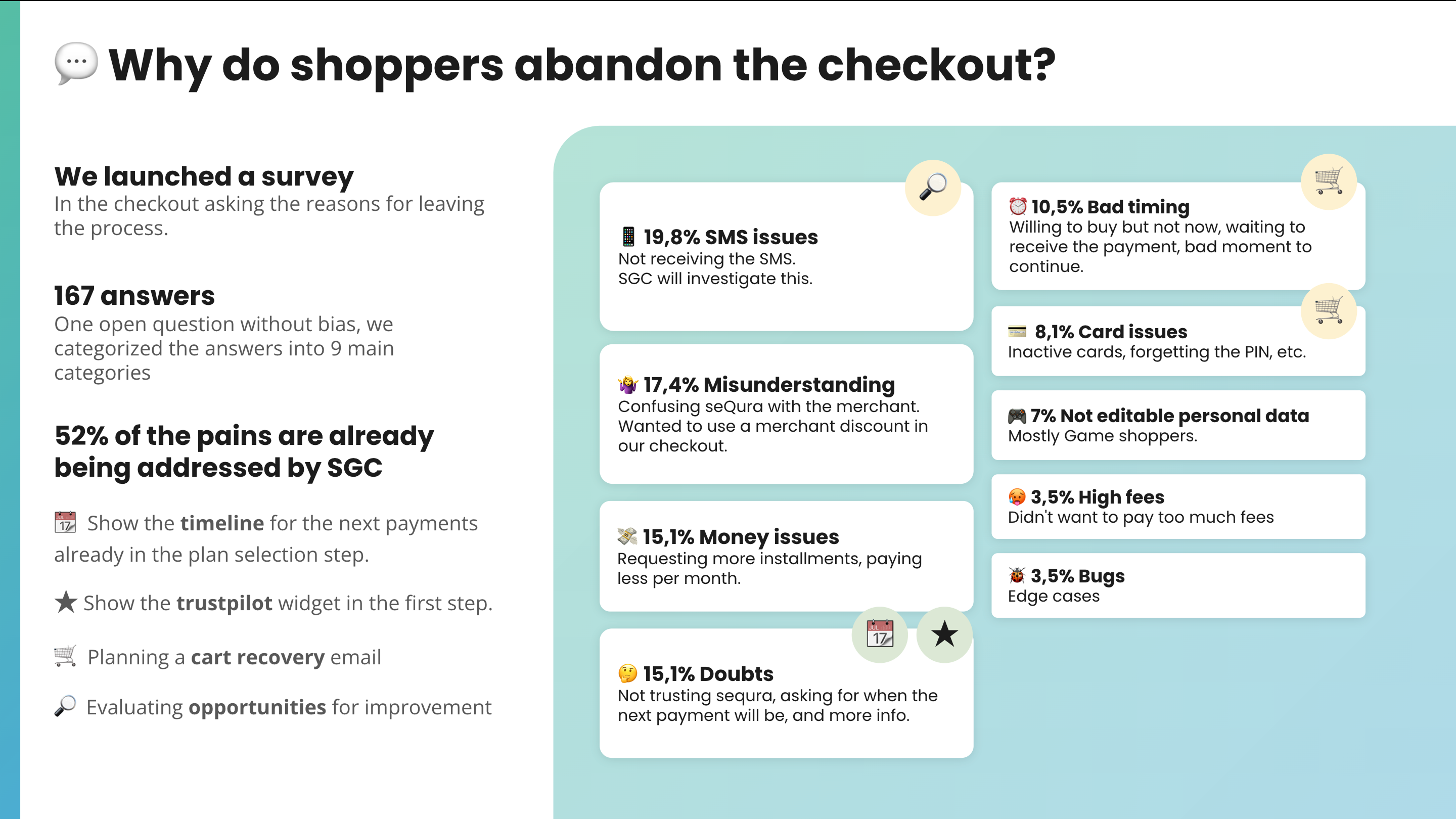
After validating the initial hypothesis through design and experimentation, we didn’t stop at optimizing the Popup experience. While it helped us better understand how users perceived seQura at the moment of decision, we still needed a clearer picture of why users were abandoning the checkout process. At this stage, we moved from hypothesis-driven assumptions to direct user input.

We launched an embedded survey within the checkout flow, activated for a limited period of time, asking users who abandoned the cart to share their main reason for not completing the purchase. This allowed us to capture real, contextual feedback at the exact moment of friction, rather than relying solely on hypothesis validation.

The insights collected from this continuous discovery approach helped us validate and refine our understanding of the problem space. We were able to move from assumptions about friction points to more concrete evidence around user hesitation, trust, pricing clarity, and decision-making barriers.

With this new layer of quantitative and qualitative data, we were able to define a more focused and impactful roadmap for the following quarter, prioritizing initiatives with higher confidence and stronger alignment with user needs and business goals.

widget